In the last three years, we have seen a vast array of hand-held gadgets appear that support quick and easy Internet access for people on the go. From iPhones to iPads and Blackberrys to Droids, the number of people carrying the Internet in their pocket has grown exponentially. Even new cars are coming with dashboard screens and devices for accessing the Internet.
For those in home care, online marketing is essential. So, if your business has not looked into making sure your website is accessible by mobile devices, now is the time.
The chances are good that when your website was built, little thought was put into how it might appear on a smaller screen, or what features might not work on mobile devices. Portable devices don’t always support the latest and greatest website bells and whistles, so if your website relies upon any of these to work, you may be losing out on a growing number of potential clients.
Back to basics
Did you know that none of Apple’s mobile devices will show anything made with Adobe’s Flash technology? That includes Flash-based videos, animated intros on your home page, or Flash-based navigation menus. Apple and Adobe have had a heated debate in recent months over this subject, and Apple doesn’t seem to be budging on its stance of not supporting Flash on their devices. Considering Apple’s large mobile device market share with iPhones and iPads, this is not something to overlook.
Many other technologies, such as certain Javascript-based effects, audio, and new windows popping open will also not work on certain mobile devices. That is why it is important to give your site a run-through on as many of these gadgets as you can.
Imagine that a potential client is in their car or sitting in a coffee shop, deciding they want to call your business and inquire about your services. They reach for their iPhone to look up your phone number but are unable to find it on your website because it is part of a Flash-based header at the top of your page. Potential client lost.
What can you do?
At the very least, you should have your website reworked to not have important content hidden behind technologies that may deter mobile devices. If your website is built upon a Content Management System (CMS) solution such as WordPress or ExpressionEngine, remedying the situation is much simpler. These systems will support the addition of layouts and themes which are built specifically for mobile devices and the content will be optimized to display on them.
Example:
Merrily Orsini’s website on a desktop web browser and on an iPhone:
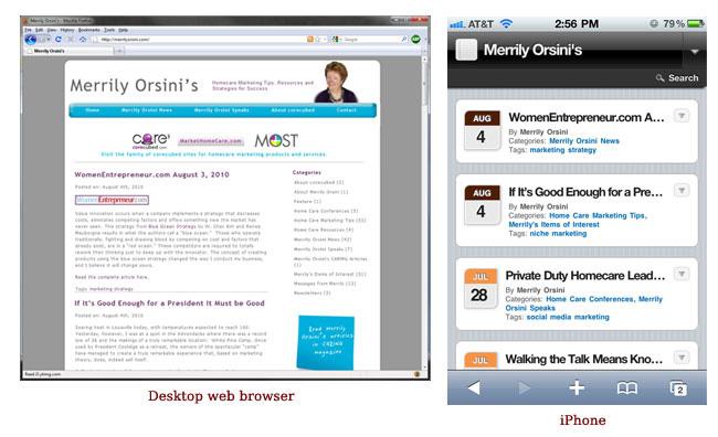
This picture shows the exact same website being displayed in two different ways, and the content is rendered in a more accessible format for the iPhone. This was done by using a free, easy-to-install plugin for WordPress called WPTouch iPhone Theme. There are other mobile-friendly themes for many of the popular CMS’s out there, and they are all designed to help your website show up correctly on a variety of screens and devices.
Supporting multiple themes (desktop and mobile) is a great way to make sure everyone who visits your site can find what they are looking for, and to ensure that they don’t miss anything.
If you have looked at your website and realized it is not mobile-friendly but are confused about what to do – never fear! corecubed is here to help you whenever you’re wondering how to market home health care services. Just let us know!