Each person takes in information differently, but as consumers, we are largely visual creatures. Take a look at your Facebook newsfeed. Which posts are you more drawn to, the ones that are nothing but text or the posts that contain bright, beautiful, and/or interesting photos or graphics? A brilliant image jumps off the page (or the screen, as it were) and draws the reader in, and the more the messages and a visual representation of the messages “speak” to a potential target, the more possible it is for that message to resonate, be accepted and understood. AND the more the possibility that action will occur as a result of the target coming into contact with the message/visual.
Take a look at these posts from our friends at the American Heart Association:
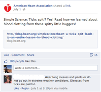

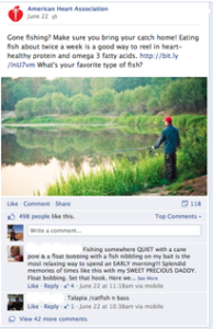
Both are great, informative posts, but which post drew you in right away? And take a look at the response each post received. Only 15 shares, 100 likes and one comment for the first one with no visual, and a whopping 118 shares, 498 likes, and 44 comments for the post with a visual. The proof is in your customers’ reactions, and they prefer visuals! And as we’ve said in the past, marrying your visual and your message is extremely important!
Additionally, colors play a big role in visual marketing. The right color will set the mood and influence a viewer’s actions in both good and bad ways. For instance, think about the color red. What brands do we typically associate with red? Coke? Target? According to color analysts, red evokes feelings of energy and urgency, and is often the color seen with clearance sales and food references. Similarly, black is seen as powerful and sleek, and is frequently used to market luxury items. Visit high-end retail sites like Tag Heuer and Burberry and you’ll see the color black heavily featured. Here’s a breakdown of how certain colors tend to influence people:
- Red: Makes viewers think of energy and urgency. It’s the color often seen with clearance sales and food references.
- Pink: This color conjures feelings of romance and femininity, and is often used to market to females.
- Blue: The color of trust and security, blue is often used by banks and businesses.
- Green: The color of money, and as the easiest color for the eye to process, green is often used in finance or entertainment sites.
- Purple: This color has a calming effect and can be seen in many ads for beauty and anti-aging products.
- Black: The color that is seen as powerful and sleek, black is frequently used to market luxury items.
In today’s highly visual marketing landscape, the images you choose are not only part of your message, they give life to your message and your brand. As more and more consumers turn to mobile devices to conduct research and purchase products and services, the visual will even become more important to the savvy marketer. And don’t forget to marry your visuals and your words thoughtfully for greater impact and bigger sales.
corecubed‘s expert elder care marketing and design team can help you create dazzling visuals and targeted messages for all of your campaigns. Contact us today to learn how we can put our elder care marketing and graphic design expertise to work for your company.