For many older adults and their loved ones, the thought of hiring a home care provider is a scary, but necessary, prospect. And with the heavy competition in the marketplace, it’s vital not to do anything that might further spook potential clients. This may sound like a no brainer, but many home care agencies don’t pay enough attention to, or overlook completely, a very important marketing element that can send customers running – design.
Too often, agency owners seek quickness over quality, asking designers for turnaround times that don’t allow for thoughtful planning and execution. Others decide to take the DIY approach, handing design responsibilities to somebody they know who “dabbles in design,” in hopes of saving money. When it comes to home care website design, these things can hurt agencies in the long term.
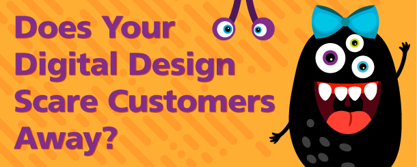
The Elements of Boo-Worthy Design
It’s easy to see a well-designed piece of marketing and think, “Wow, that looks great!” Similarly, we also know instinctively when we’re looking at something cringe-worthy. But what is it about bad design that makes it, well, bad?
- Don’t lead with fear. People searching for home care services have enough on their minds already. They don’t need you to compound their stress by using guilt and fear to persuade them to buy your services. Help them solve their problems instead with informative, educational, and useful content. Dump the scare tactics and statistics.
- Don’t kill them with the kitchen sink. We want potential clients to have all the information they need in order to make a decision, right? Well, yes and no. When it comes to home care website design, information is important, but what you really want is for the phone to ring. In an effort to make the phone ring, agencies often try to pump as much text (everything but the kitchen sink, or including the kitchen sink!) onto every page of their website, but that ignores the way people read online. Research shows that people skim and scan content online, which means the eye tends to avoid big chunks of text, preferring shorter paragraphs and lists. So if your website reads like a novel, you’re definitely scaring away your visitors and potential customers.
- We can’t communicate but we want to care for your loved one. In the age of texting, the art of grammar seems to have fallen by the wayside. But when it comes to displaying professionalism on a website, bad grammar still speaks volumes. Bad spelling, writing, incoherent sentences, incorrect punctuation, etc. on your website is a concerning thing for people to see. After all, if you can’t write, spell, or punctuate properly, or hire someone who can, can you provide quality care?
- Leading them down a dark path to nowhere. Getting lost in the woods is horrifying for the teens in a scary movie. Getting lost on a website can be equally maddening for your users! When visitors come to your website, they should easily be able to find the information they need and understand what they can do next and what actions to take to reach their destination.
- “Clever” design vs. clean design. Creativity in design is great, but when usability takes a backseat, your “clever” design can become monstrous. For example, a full screen animated dancing granny might seem like a fun and clever way to show that your agency is different and focused on independence, but when users can’t click away from it in order to learn about your services or fill out your contact form, they’ll move on to an agency with a more user-friendly site, clever or not.
- Font fatalities. There are some creative fonts out there, and it can be tempting to use multiple fonts, but this can make your website look like a ransom note. Fonts with flowing, curling letters can be very difficult to read, as can using colors that don’t contrast well with each other. A clear and powerful contrast between the elements can help the user better read and understand your info. And remember, many of your users may be older adults, so font size is very important as well.
- Colors that don’t match your brand. Your website is the visual representation of your business. Therefore, the colors you choose to use on your website are actually telling people they are in the right place. If the colors of your logo are green and brown, users will be confused if they end up on a site with a red and purple color palette.
Quality home care website design doesn’t have to be scary for you or your clients. Working with a digital design expert, like corecubed, can help you ensure that your agency has a compelling, clean, and creative online presence that represents your brand in the best way. If you want to make sure you’re not spooking your potential clients, contact our home care marketing and design experts to learn how we can take your digital and home care website design from boo to beautiful.