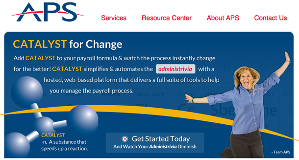
A landing page is the page website visitors arrive at after clicking on a link, usually from an advertisement. It can be a website’s home page, or a more pared down page that gives readers a bit of good information and encourages them to investigate further. Because your landing page is essentially how your company makes a first impression online, it’s extremely important to make it perfect.
So what do we mean by perfect, exactly? Well, there are several key areas to focus on with landing pages. The main points of your landing page should be to draw potential clients in, display your knowledge or industry expertise, and provide users with a strong call to action, all with content and images that engage visitors to your site and makes them want to explore further.
Let’s dig in a bit further:
- Headlines: As one of the first pages your potential clients see, your headlines should be clear, concise and address a specific point related to the rest of your content. Similar to newspaper or magazine headlines, a landing page headline should catch a reader’s attention and make him or her want to keep reading.
- Links: You certainly want to link visitors to your website, but on a landing page, links should be simplified so as not to overwhelm the page or the viewer. While multiple links make sense on your regular home page, your landing page should be more streamlined.
- Call to action: This is the most important aspect of a good landing page. You have your potential customers at your door; now tell them what to do next. Invite them in with a “Learn More” button; entice them to purchase your product with a “Buy Now” or “Download Here” link. Make your call to action strong and unambiguous. For instance, when Mozilla Firefox changed their call to action from “Try Firefox” to “Download Now – Free” during a test phase, they received 500 more downloads with the newer, more direct and confident messaging. Additionally, calls to action should stand out, as they are truly the focus of a landing page.
- Grammar: No matter what product you’re selling or what service you provide, poor grammar and spelling on your site will make your company seem unprofessional and will lose the trust of your customers. Hire a pro to get the job done right!
Another aspect to consider when developing a perfect landing page is color. The right color will set the mood of your landing page and influence a viewer’s actions (in both good and bad ways, so choose wisely). For instance, if you landed on Target’s landing page and the primary color there was, say, purple (or anything other than red, really) you’d be totally thrown off balance and likely you’d think you were on the wrong page altogether. If you have an established brand, it’s probably best to stick with your brand colors. Here’s a breakdown of how certain colors tend to influence people:
- Red: Makes viewers think of energy and urgency. It’s the color often seen with clearance sales and food references.
- Pink: This color conjures feelings of romance and femininity, and is often used to market to females.
- Blue: The color of trust and security, blue is often used by banks and businesses.
- Green: As the color of money, and as the easiest color for the eye to process, green is often used in finance or entertainment sites.
- Purple: This color has a calming effect and can be seen in many ads for beauty and anti-aging products.
- Black: The color that is seen as powerful and sleek, black is frequently used to market luxury items.
Getting the slickest landing page takes some effort, but the right page can make all the difference in terms of sales and web traffic. Take a look at this page for some awe-inspiring landing pages, and notice their simple yet eye-catching designs, their bold calls to action, and their use of color.
Need help creating the perfect landing page? Contact corecubed today! Our expert designers and writers will bring your customers in for a smooth landing.
