You’ve seen them… “click here, download now, sign up here.” Those eye catching buttons, both big and small jumping off a web page at you, begging for your attention. This is the all important call to action button. It is designed to get users to do something very important and how it is created is more involved than just making it pretty. A few things should be taken into consideration when creating this useful tool.
Location – the button must be placed in a location that is easy to find for the user. Buttons that are higher on the page may see more action than those lower on the page. If your page has more than one call to action button, then you have to decide which is more important and place that one higher.
Size – your button’s size should match the level of importance you have placed upon its action. You want eyes to be drawn immediately to the button, so size matters! Of course, if you have additional buttons on a page they should vary in size based on importance.
Whitespace – crowding other elements around your button can take away from its effectiveness. A good cushion of whitespace will help it stand out and be seen.
Color – color is my favorite element of designing call to action buttons. You want your button to be noticed, therefore using a bright, contrasting color is vital. No need to get carried away here, though. Choosing even a flat color can make your button jump off the page if it is in good contrast with its background.
Wording – now that you have a beautifully designed, well placed button, you have to decide what it will say. Action words are a great start. Adding in others that reference price (like the word FREE!) can do wonders. For larger buttons, you can use that extra real estate to provide additional instructions or more info.
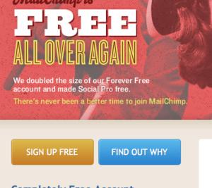
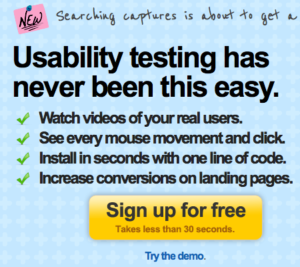
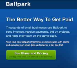
Here are three great examples from around the web:
Mail Chimp


Userfly

Ballpark

If your call to action buttons aren’t getting the attention you’d like, give us a shout! We’d love to redesign them for you and start bringing in those clicks!

