Think of the last time you walked into a room and instantly felt at ease—or maybe on edge. Was it the lighting? The furniture? Or was it the color of the walls? In marketing, color has that same subtle yet powerful effect. It can evoke feelings, set expectations, and—believe it or not—make or break a first impression. For home care agencies trying to build trust and stand out, color is more than just a design decision; it’s a strategic one.
So, how much influence does color really have? And what role should it play in your agency’s brand identity and marketing materials?
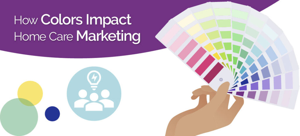
The Psychology of Color: What the Research Tells Us
There’s long been a debate about whether specific colors cause specific emotional reactions. While it’s unlikely that one color universally triggers a single emotion (since cultural and personal experiences influence perception), there’s no denying that color influences consumer behavior.
Recent research continues to confirm that color plays a pivotal role in shaping how people perceive and respond to brands. A 2025 study, Psychology of Color: Its Influence on Marketing and Design, found that color choices can significantly influence a consumer’s emotional state, trust in a brand, and decision-making speed—often within milliseconds of first contact. This rapid response happens because color cues are processed in the brain’s limbic system, the area that governs emotions and memory, meaning your brand colors could be influencing a prospective client long before they read a single word on your website or brochure.
The Behavioral Neuroscience Meets Color Strategy report also highlights how context and environment affect color perception. For example:
- Warm hues like red or coral can spark urgency, energy, and heightened attention—making them useful for limited-time offers or calls to action.
- Cool hues such as blue or teal tend to evoke calmness, trust, and stability—ideal for industries like healthcare, where reassurance is critical.
- Natural greens are increasingly associated with holistic well-being and environmental responsibility, aligning with the rising preference for brands that project care and sustainability.
Together, these findings reinforce the importance of intentional color selection—not just for aesthetic appeal, but as a core strategy to build trust and emotional connection in home care marketing.
What Colors Communicate in Home Care Branding
Here’s how some of the most commonly used colors in the home care industry tend to be interpreted:
- Blue: Often associated with trust, calmness, and professionalism. It’s a top choice in healthcare for a reason: it puts people at ease.
- Green: Signals growth, wellness, and balance. It can give your brand an approachable, natural feel.
- Purple: A color often tied to compassion, dignity, and support. It’s frequently used in dementia and hospice care branding.
- Orange and Yellow: Energetic and warm, these colors suggest optimism and friendliness but should be used sparingly to avoid looking too bold or unprofessional.
- Gray and White: Clean, modern, and neutral tones often used to communicate clarity, order, and simplicity.
The key isn’t just picking a color that feels “nice.” It’s choosing a palette that aligns with the values your agency stands for, and the emotions you want families to feel when they come across your website or brochure.
Color Is Crucial to Defining Your Identity
Your color palette should carry through all touchpoints: your website, business cards, social media graphics, uniforms, and printed materials. Consistent use of color helps strengthen brand recognition. Over time, it can even help prospective clients remember your agency more easily.
Think about national brands like UPS (brown), T-Mobile (magenta), or McDonald’s (red and yellow). Their colors are part of their identity. Your home care agency may not be a global franchise, but the same principles apply.
Designing With Intention
Color choice is just one piece of the puzzle. Typography, imagery, layout, and tone of voice all play a role in how your brand is perceived. But color sets the stage. It creates a visual atmosphere that either invites people in, or makes them feel disconnected.
If you want to reach families during an emotional, often vulnerable decision-making process, getting that atmosphere right is essential.
Want to Strengthen Your Brand Through Color?
From your website to your brochures, your colors are doing a lot of heavy lifting. Are they saying what you want them to say?
At corecubed, we specialize in aging care marketing strategies that connect: visually, emotionally, and effectively. Whether you need a full rebrand or just a color refresh, we’re here to help you make a lasting impression.
Call us at 800.370.6580 or contact us online to start building a brand that truly reflects your values and resonates with the families you serve.